This year, I was given the task to improve my AS work as my previous work wasn't to a good standard. After speaking to Mrs Hopkinson about my work, we agreed that I needed to create a new contents page as my old one wasn't good enough. I found a style model for a contents page which was from Rolling Stone magazine -
From viewing this style model, I decided to create a simple, but effective contents page with the usual conventions, but to keep the page clear and understandable. I used two images of different people, one large picture which is the main piece of the page. I chose to make this image the largest as my article page is based upon this fictional band 'Suicidal Unison'. My other picture is of a female girl - who is located at the top of the contents page. I kept this picture quite small to not take the centre focus away from the main image.I kept the colour scheme similar to my front cover, I have used red and black throughout as they are the colours of my magazine logo.
After taking the new photos, I colour adjusted them on Photoshop and made sure the contrast was editing making the photo look more professional.I have published the contents to the left of the main photo, in a vertical list making more room for the contents to have a stand out photo.
I have also made some minor tweaks to my front cover. I have made the main image larger, and again colour adjusted the photo so it looks more professional, and is much better than contested than before. I removed band names down the left side, and added sub-headings to articles inside the magazine, following typical conventions of music magazines. I positioned the name of the artist below centre in the picture in a stand out font so the viewer would be directed to the text and the quotation underneath it.
Overall, I believe I have made a huge difference to my magazine by making it look more professional and having improved my contents page, I feel I have made the whole magazine better than the previous one.
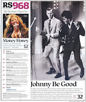
Style Model -
The Rolling Stone contents page uses one main image ,and a smaller image shadowing the larger one to the left ,ensuring all attention goes to the larger black and white long shot of the two men dancing .Underneath the image, it has a main headline and information about what the article is about.The text for the main headline saying 'Johnny be good' is in a black bold font therefore making it stand out more ,it is also the same font used on all the larger fonts .
Clicking these links will take you to the rest of my evaluation.
http://reecebeveridgemedia.blogspot.co.uk/search?updated-max=2012-11-20T01:20:00-08:00&max-results=7&reverse-paginate=true
http://reecebeveridgemedia.blogspot.co.uk/search?updated-max=2012-05-04T04:10:00-07:00&max-results=7&reverse-paginate=true&start=7&by-date=false

No comments:
Post a Comment